Wednesday, 27 October 2010

simulated client project and summer work continued post 3, story boards

As a supplement to the visual and audio aids inside the level I have designed I thought with a strong story line to work alongside the game it would push the moral understanding further than if the game just stood by itself. Here are a few story boards that I produced to give a preliminary introduction before the level that's a prologue for the main story, before it brings the player to the present with the present time. Please excuse the dramatic writing as I am by no means a script writer. The images are pre-existing images pulled off the internet to give a round about idea to the visuals that would be used in the cinematic, not as an overall representation, as most are just Google searched.

Opening Cinematic


Ending cinematic


I thought that with the aid of these cinematics the player would really get a sense that through playing the level and ignoring what the facility, protecting the corperation's hard work; they could really get a feeling that what they have done was wrong, in turn supplementing the subconscious learning aspect to the level.

Thursday, 21 October 2010

simulated client project and summer work continued

continuing for the last post and the concept map drawing, I began to build my map from scratch. after a few teething problems with ut3 editor I transferred my work to UDK editor, I began sculpting the map terrain. I already had the idea for a hidden base in a jungle environment to make it see, like the corporations hiding the software were going to large lengths to protect their software, but also thought it controversial as a representation of all the treasure Britain still retains from other cultures that we are slowly giving back over time to the country's of origin taken at the times of the British empire. The route to the base was going to be quite linear so to make orientation though out the level pretty one way to the objective.


I progressively started building up the level bit by bit. adding different variations of static meshes making the environment more believable as I went.the working process is represented below in chronological order of photos.


so after all the static meshes had gone I worked on the lighting and special fx of the level and this pretty much brings me up to date with where I am ..... few lol


I'm currently working on new static meshes to go into my map so im sure there will be a new post about that soon. cheers =)

simulated client project and summer work

So final year begins and im not going to hide that im scared as hell! summer was a fun filled experience being back in my time warp town of which the people get older but don't move on much. Moving away from the drama and drabness ill start with my work over summer.
Over summer with the long hours of work trying to earn back some of my student overdraft I managed to draft up a sketch of a level design and build the geometry in unreal tournament 3 editor. this was based off a similar drawing but was revised to a design i thought would better work to help the movement about the map. as the only map really i have made was more of a way to show off my skill set in using the tool set I wanted to make a playable level this time. Here was the sketch of the revised level from top view.
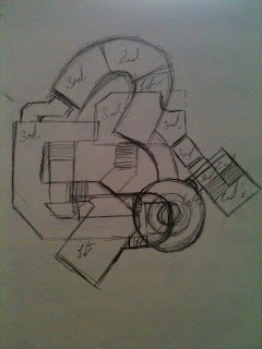

The original design was based on a one floor approach where moving from room to room in a lateral sense was how you orientated the level. I felt that could be a bit restricting on the design over all so I devised this rough multilevel to encourage a high level of movement and ultimately more intense game play. This however was a very rough sketch, and as all rough sketches they always change in the process in the attempt to make it a more successful test project.
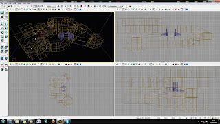
the images below show the build process of the level and the relevant changes in top, side, front and perspective views.
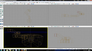
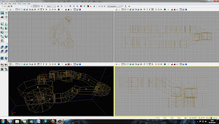
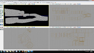
As you can see from the pictures of the top view they no longer really look like the original design. As i was following some of my ideas from the original idea I saw ways to utilize the space to give a freer flow of movement to the player. I started to apply materials and textures to the walls before static meshes but it came to the time of going back to uni so everything holted to pack move an settle in in my new fantastic flat! (good student digs are always a must)

First lecture in and a new project is set and with a four week turn around to boot. Time to start the ball rolling to how I will be in the rest of this year head down engrossed in work. as much as student can be I suppose =)

Our brief is to tackle the issue of/or informing about piracy, such as digital piracy in what every way we want. A pretty open project as we could choose to go pro or against piracy. Leaving this decision to students to make that kind of decision may have been a mean one as in little more than 6 months we will be looking for jobs it may be frowned upon if we decided to back piracy.....
So naturally my thought process was to incorporate being a digital pirate into a game (lets see how that works out for me =S).

I have never really had to think about a set story line into my games before as I have never really considered the idea of being a games story boarder and most of my experience was in the death match multiplayer area of games. There are probably too many multi player map designers coming out into industry so i thought i would try and push the boundairys a bit and design a objective style map where a player works towards a finish point getting collectables enabling the finish point after a certain number are collected.

Considering my brief I was working to in all of this, keeping in context its piracy nature, I went about setting some kind of storyline to work to before I went about the whole design. I am still amazed even to this day the learning potential of games as a whole. I find in enthralling that a child of 5 to 7 can have such a intricate knowledge base through playing games learning things that maybe a child that didn't play games would not. Most computer game playing children have a extensive knowledge of weapons in first person shooters that are real life weapons today, they also know about ancient civilizations that they explore that they may not learn about until older or studying history of cultures. Just through the interaction of the game they can learn so much about any era of subject matter the game is based on.

Taking things a bit more out of concept, Disney films old and new play on moral teaching to enhance their storyline, such as love and hate and good overcoming evil. Even though the child isn't actually engaging with the film for the moral understanding, me as a kid never watched it for the morals but more the interesting characters an animation, but the engagement causes a subconscious knowledge of right and wrong or what ever the films message was about.

In a similar way to the learning process of computer games and moral understanding in the subconscious I thought that I would put the player in the persona of the pirate trying to steal a piece of software, but through out game play informing players of consequence of what their damage their actions of stealing are causing through sound lighting and visuals.

I had a idea of a story building movie setting the scene of a money starved culture where stealing in any sense was become more prevalent. police were now becoming less powerful as they are now stretched capacity. corporations realising the instability's start moving underground to protect themselves and their products. piracy for many is a very tempting outcome of the modern society, making lifestyle cheaper and rich with accessibility, but not without great risk. The player is a pirate that has come to a far out and hidden facility so steal software for money, but finds that the consequences of his actions causes more instability to society causing corporations to go into liquidation, causing humanity to go into regression. Ultimately the player would move towards becoming a saviour by taking back from pirates what they stole and returning the vital developments back to the corperations to atone for his sins.

Being realistic a game of that much intensity isn't what i could do start to finish in 4 weeks so i wanted to do like the prologue where the pirate steals the software sucsessfully whilst playing through the level I was to design and sends the world into chaos, as this holds the most weighting morally of the game.

few now that the explanation of my thought process is over now to some of the designs. =D
this is a top down view of my original design of the map lay out

Tuesday, 25 May 2010

Hi Res Renders

more airport Hi Res Renders. this brings this project to a close now. hope you like what you see


airport design 3 by ~reaperreal on deviantART


airport design 4 by ~reaperreal on deviantART

Monday, 24 May 2010

Hi Res Renders

Exactly what it says on the tin! deal
airport design by ~reaperreal on deviantART

airport design 2 by ~reaperreal on deviantART

Airport the finished animation!!!!!! whooooooop


The final finished product. Enjoy!

Wednesday, 14 April 2010

Night scene light working for the Airport


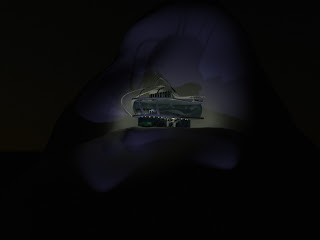
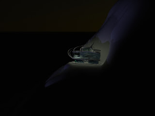
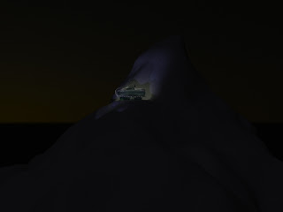
Just a few pictures of the lighting going into a night scene. The test was to deem how lights mixed on the fore ground of the mountain and to realise how to highlight the architectures organic flowing nature onto the mountain. The idea of the design was to keep the building flowing like freshly dropped snow onto a mountain, pretty much seamless, rolling and untouched. I think that the shadows emphasis the natural feel for the building to be there which was something I wanted to get out of this. there is still alot of inside lighting to go yet to get it looking right inside the scene but as far as the ambient lighting goes im pretty happy so far.

To pronounce the mountain that was seeming to be lost in a black abyss, I used a omni with the shadows turned off in a deep blue colour to emulate the glaze of the moon washing onto the snow. This highlighted the mountain a little more so to set the scene. This was shown in the third image but I still think the light needs toning up a little into a lighter blue

Tuesday, 6 April 2010


here's some updated photo's of the scenes of some of my projects. their coming along slowly but im finding that different renderers are better at certain things than others. im using the default scan line for my animation for the speed of its rendering an mental ray for its accurate photometric calculation of light passing through glass.

Monday, 15 March 2010

Thipit the tea loving demon


for some reason the images always seem darker when I upload them but here's the finished character Thipit.

Tuesday, 9 March 2010

Thipit my new animation model is almost finished!

Again i seem to be skirting round posting my progress up on all my projects but here's a update on what I've been doing with my animation project. The rigging is complete and all of the envelope editing is done, so the character now has fairly believable movement without folds of the skin and massive imperfections. So some good headway! I realised that I turbo smoothed after I added the skin modifier which wasn't really how we have been taught to do it, but in the long run I think it made it easier to edit the envelopes on the rig. I tried switching it over but it ruined all the envelopes I had edited and was really hard to alter to get them to work again to I decided to just keep it as it was. Its made it harder to model the final out of the character look as Fine tuning the model with the extra vertexes would have made it easier, but because of this I have to keep making small changes and putting turbo smooth on to see how it has affected what the model. I think im stronger in doing the small tweaks in modelling but I've got used to how turbo smooth interacts with a base model so its worked out better that i made this mistake. Noted for the future though =D anyway here are some pics of the model so far. im just about to do some morphers on it to give the character some interesting facial expressions so thats why there are the floating heads in the scene.

.

Thursday, 18 February 2010

Airport design continued


here's the latest update of how my main building of my airport is coming along.
there's a few thing that need changing but its pretty much all there

Airport design continued

I recently posted up some of my initial ideas and influence for my airport but didn't post up any of my other stuff I had done at that time so this is like my catch up session.
After doing my research I started to formulate what I wanted to get out of this design. I wanted it to have a flowing organic feel that expressed in itself its elements of futuristic design. With all architecture the design is built around its purpose so I looked into peoples ideas of futuristic transport.From looking at these I realised that convensional shaped craft in the future would probably not exist as planes may then be vertical take off and have some sort of anti gravity function (being all sci fi like =D) i thought this would aid my design of my airport as this would be based in a mountain. On snowy peaked mountains there is obviously little ground to build run ways so a vertical take off hanger would fit quite nicely into my design aspects.
I started dgetting initial ideas drawn downI started to draw out ideas from my head to get some initial ideas down. and what I came up with after a while of drawing was this...After I finished doing this design I knew this was perfect for what I wanted to achive from this airport. the curves were organic in their look and looked similar to avalanche precautions they put over the top of roads to stop them being cut off and blocked if a avalanche occurs.

The hanger was going to have to be a special kind if it was to accommodate for V.T.O's taking off and landing in it. I designed a revolving hanger bay that spins to accomodate mor planes at its front. It shelters planes one inside by keeping them away from the elements as only a limited fraction of the hanger is visible to the cliff face, and with closable doors at its front its protected there too from the snow. this is what it looks like...

animation of the lovely cup of tea

For my animation project I have to design a character making a cup of tea in the most inventive way that I can. I started to sketch out a few designs of my character and this is what I came up with. I realised this wasn't the sort of ergonomic design in which we were getting taught how to build our characters after the first few weeks of tutorial, rig them with bones, but then again I've never taken the easy way with any of my projects so far.

I started to get my ideas down on a page in a spider diagram, more for myself just so i could see what ideas I had down in front of me. If there was any influences I think I should look at at least they are in some sort of list ect.

With my general ideas down i did a story board of how I envisioned the animation should/will look by the end of my animation.

Whist doing all these designs I had already started to make my character. Here is a picture of my fully rigged character.

This is my progression so far with this project. Ill put my next post up soon. =D